If you have recently gotten on the bandwagon and have been trying out your hands with the Gutenberg editor and its developer interface then you may have spent good amount of time on already learn about the editor and creating your own blocks.
This tutorial however is not about creating blocks, I assume you have already created a block and now are looking to add option for the user to control color of something in your block, for e.g the background or text color.
I will write an article on creating an editable Gutenberg block from scratch using the best practices.
I started off with a very simple block, it has a block of text, just that, I also added predefined styles using the `styles` option, but I wanted the user to have extra control on how the block should look and so I wanted to add color selection option and reflect what they chose on the block, both on the editor and the front-end. Due to lack of documentation and guides on Gutenberg it took me a while to figure out how to do it correctly, but here we are. So let's start.
A few things to note:
Then from wp.components get these:
It's not very crucial for the whole color setting thing but still a good practice to get these components in order to make the inspector control look cleaner.

I personally prefer assigning the JSX to a constant / variable and then use it conveniently in the `edit` function. So here's the code for outputting a simple color selection in the Inspector Controls.
That's it. You are done. Have a good one!
No, I am not leaving you in the middle, if you want help with understanding the code and also seeing an example `save` and `edit` function then read on.
What's going on? The tag <InspectorControl> defines the, of course, inspector controls, <PanelBody> is just a container component to contain our various settings.
<PanelColorSettings> is the real deal. It's the editor component that is responsible for bringing up the color selector and as you can see it contains quite a lot attributes, so let's go through it as well.
Now there can be multiple colorSettings in the array.
Let's see how we can make use of the new Inspector control we just added. First step is to declare an attribute for the block that will hold the value of the selected color as a string, we will name it blockBackgroundColor
And then bring that in your edit function
Remember we set onChangeBackgroundColor to the onChange event? So let's create that as well.
Cool. Now we have a working inspector control that you can use to choose a color. However, it's of no use if you are not applying the selected color somewhere. Let's take a look at a simple example on using the selected color in both the edit and save function.
This tutorial however is not about creating blocks, I assume you have already created a block and now are looking to add option for the user to control color of something in your block, for e.g the background or text color.
I will write an article on creating an editable Gutenberg block from scratch using the best practices.
I started off with a very simple block, it has a block of text, just that, I also added predefined styles using the `styles` option, but I wanted the user to have extra control on how the block should look and so I wanted to add color selection option and reflect what they chose on the block, both on the editor and the front-end. Due to lack of documentation and guides on Gutenberg it took me a while to figure out how to do it correctly, but here we are. So let's start.
A few things to note:
- I am using ESNext, it's just easier to write JSX in it, however if you know JS well you might already know how to convert an ESNext code to good 'ol JavaScript.
- Also, this site uses some ancient syntax highlighter so bear with me until I get a new one.
Get the dependencies first
From wp.editor we need these:
const {
    InspectorControls,
    PanelColorSettings,
    ColorPalette,
} = wp.editor;
The above is what we need for Inspector Control and color selection, you might have others on your list as well, so that's okay.
Then from wp.components get these:
const {
    PanelBody,
    PanelRow,
} = wp.components;
It's not very crucial for the whole color setting thing but still a good practice to get these components in order to make the inspector control look cleaner.
InspectorControl can be anywhere
Since it is something that appears in the sidebar and not as part of the content of block it doesn't matter where we place it in the code, it can be anywhere inside of the main wrapper of the block. Do note it goes inside of `edit` function of your block though.
I personally prefer assigning the JSX to a constant / variable and then use it conveniently in the `edit` function. So here's the code for outputting a simple color selection in the Inspector Controls.
const myInspectorControls = (
 <InspectorControls>
  <PanelBody>
   <PanelColorSettings
    title={ __( 'Block Background Color' ) }
    colorValue={ blockBackgroundColor }
    initialOpen={ false }
    colorSettings={ [ {
     value: blockBackgroundColor,
     onChange: onChangeBackgroundColor,
     colors: backgroundColors,
     label: __( 'Choose a background color' ),
    } ] }
   >
   </PanelColorSettings>
  </PanelBody>
 </InspectorControls>
);
That's it. You are done. Have a good one!
No, I am not leaving you in the middle, if you want help with understanding the code and also seeing an example `save` and `edit` function then read on.
What's going on? The tag <InspectorControl> defines the, of course, inspector controls, <PanelBody> is just a container component to contain our various settings.
<PanelColorSettings> is the real deal. It's the editor component that is responsible for bringing up the color selector and as you can see it contains quite a lot attributes, so let's go through it as well.
- title: The title is what shows up as the control's title.
- colorValue: This is important one, you assign to it the value, i.e the color it will have. `{ blockBackgroundColor }` is the attribute that's been set-up when registering the block (we will come back to it later, if you do not understand how it will work then keep on reading.)
- initialOpen: boolean, whether the panel should be open by default.
- colorSetting: it is an array of objects with four keys namely value, onChange, colors, and label
value: The same color value blockBackgroundColor
onChange: callback when the color is changed
colors: This takes an object of color names and hex values and shows it on the color settings before the color picker. So you can show a few preset of colors if you want.
Now there can be multiple colorSettings in the array.
Let's see how we can make use of the new Inspector control we just added. First step is to declare an attribute for the block that will hold the value of the selected color as a string, we will name it blockBackgroundColor
attributes: {
    blockBackgroundColor: {
        type: string,
        default: '#000' // is optional
    }
}
And then bring that in your edit function
edit ( props )  {
 const { attributes: { blockBackgroundColor }, setAttributes } = props;
 // other code..
Remember we set onChangeBackgroundColor to the onChange event? So let's create that as well.
function onChangeBackgroundColor( newBackground ) {
 setAttributes( { blockBackgroundColor: newBackground } );
}
Cool. Now we have a working inspector control that you can use to choose a color. However, it's of no use if you are not applying the selected color somewhere. Let's take a look at a simple example on using the selected color in both the edit and save function.
edit( props ) {

 // all the other codes...


 const myInspectorControls = ( <InspectorControls>...</InspectorControls> );


 return(
  <div
      className="my-simple-block"
      style={
       {
        backgroundColor: blockBackgroundColor
       }
  }>
    { myInspectorControls }
    <RichText/>
  </div>
 );

}

save( props ) {

 return(
  <div className="my-simple-block"
      style={
       {
        backgroundColor: props.attributes.blockBackgroundColor
       }
  }>
     // something
  </div>
 );
}
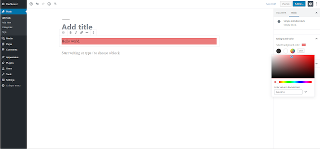
Here's a screenshot of working example of a simple block with color setting
I have just uploaded a very simple Gutenberg block's plugin code that registers a block with color settings, you can find it here StramaXon Gutenberg Blocks
Stay tuned for more Gutenberg blocks tutorial, also let me know tutorial around which aspect of Gutenberg Blocks you want to see next, on my to-do list I have Alignment toolbar setting so do subscribe to get notified when it comes out.